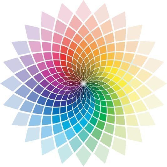
Colour Science
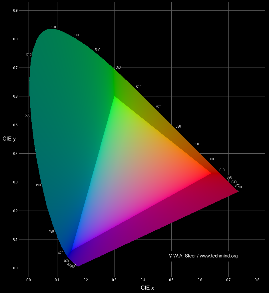
The inverted-U shaped locus boundary represents monochromatic light, or spectral colours (loosely rainbow colours). [Wavelengths shown in nm]
The lower-bound of the locus is known as the line of purples and represents non-spectral colours obtained by mixing light of red and blue wavelengths. In reality this boundary is not hard, as the colours just become dimmer and dimmer owing to the falloff in sensitivity of the receptors of the eye at the extreme ends of the visible spectrum.
Colours on the periphery of the locus are saturated; colours become progressively desaturated and tend towards white somewhere in the middle of the plot. The point at x = y = z = 0.333 represents the white perceived from an equal-energy flat spectrum of radiation.
Any colour within a triangle defined by three primaries can be created (or recreated) by additive mixing of varying proportions of those primary colours.
The brighter triangle in the centre of my plot shows the colours which can be reproduced by a standard CRT television or computer screen. The vertices have the colour-points of what are known as Rec.709 primaries. The colours accessible to a given display-device are known as its gamut.
Colours outside my triangle are said to be out-of-gamut for, and cannot be reproduced on, normal display screens (or even recorded in many common image file-formats). They are artificially desaturated in the plot above. Standard monitors are particularly incapable of reproducing saturated greens and turquoises. Mathematically, colours outside each edge of the triangle require a negative amount of light from the opposite primary. Clearly this doesn't make physical sense; what it means, essentially, is that the primaries defining the nearest edge themselves "contain" too much of the opposite primary colour.
I have taken great care to render my plot such that colours within the triangle will be displayed accurately on a PC with an sRGB-compliant monitor with white point set to 6500K whose brightness and contrast controls are properly set, assuming no (non-standard) system gamma control is in force.
For all its simple derivation from eye-response functions, the 1931 CIE chromaticity diagram is not perceptually uniform. That is to say the area of any region of the plot does not correlate at all well with the number of perceptually-distinguishable colours in that region. In particular, the vast area of green-turquoise inaccessible to televisions and monitors is not -quite- as serious as it appears.
Other colour-space coordinate systems and plots exist; examples include CIE 1976 u,v, also CIELUV, CIELAB... in general, by means of fairly abstract transforms these attempt to be more perceptually-uniform (with only limited success). Their use is fairly specialised. The simple and direct relation between CIE x,y and the eye-response functions probably accounts for its enduring popularity.
CREDIT:
http://www.techmind.org/colour/index.html
COLOUR LIGHT BOOTHS
Colour Temperature
It is well known that when an object, such as a lump of metal, is heated, it glows; first a dull red, then as it becomes hotter, a brighter red, then bright orange, then a brilliant white. Although the brightness varies from one material to another, the colour (strictly spectral distribution) of the glow is essentially universal for all materials, and depends only on the temperature. In the idealised case, this is known as 'black body' or 'cavity' radiation, and is described by Planck's Radiation Law:
Spectral energy density, U(λ,T) = 8πhcλ-5 / ( ehc/λkT-1 )
where
λ is the wavelength, in metres
T is the temperature in Kelvin (add 273 degrees to Celsius temperatures to get Kelvin)
h = 6.626×10⁻³⁴ J·s [Planck's constant]
k = 1.381×10⁻²³ J·K-1 [Boltzmann's constant]
c = 3.0×10⁸ m·s-1 [speed of light]
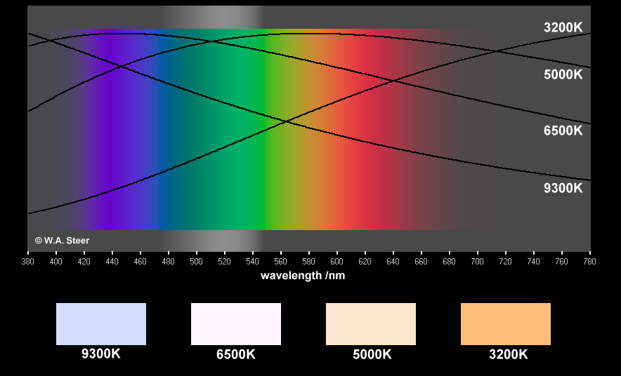
The figure below illustrates the relative amounts of energy at each wavelength across the visible spectrum, for a 'black body' at 3200K, 5000K, 6500K, and 9300K. A conventional incandescent light bulb emits light (and heat!) from a tungsten filament heated to high temperature by passing an electric current through it. Spectral distribution (including colour) of the light from a quartz-halogen lightbulb is similar to a black body source at 3200K, and is therefore well-approximated by the Planck Law. Light from the sun, measured in space, is close to black body radiation characteristic of temperatures around 5000-6500K.
Artificial sources of light, in particular discharge lamps (sodium, mercury, xenon) and fluorescent lamps can have extremely spiky spectral distributions, and this means that their colour rendering properties are very poor (even if the overall perceived illuminant colour is close to a blackbody colour).
In professional lighting, a Colour Rendering Index, CRI (sometimes written Ra) is often quoted to indicate how accurately that light will portray colours relative to a blackbody source at the same nominal colour temperature. By definition, all blackbody sources have a CRI of 100. Fluorescent lamps typically have CRIs in the range 55-85, with 80-85 being classed by the manufacturers as 'good' or 'very good' colour-rendering. I beg to differ! To my critical eyes, light from 'triphosphor' fluorescents with a CRI of 80-85 is ghastly; extremely flat and lifeless. By comparison, a nice incandescent quartz-halogen spotlight really gives vitality to whatever it shines on.
CREDIT: http://www.techmind.org/colour/index.html